Alone in the Dark — Old School vs. Modern Guidance
There’s a lot that can be said regarding the new remake of Alone in the Dark. However, it does offer you a decent amount of accessibility options for your time in Derceto Manor. We’re going to answer the question: should you select Old School or Modern Guidance in Alone in the Dark?
Whenever you start a new game in Alone in the Dark, you’ll have more than difficult options to choose from. Along with difficulty, players have a choice of two preset Guidance options: Old School or Modern.
Modern Guidance gives you all the quality-of-life upgrades expected from a modern game and more. Conversely, Old School Guidance says it gives you no help, forcing you to figure out the game for yourself with no help.
This can make puzzles like finding the broken plates harder or easier depending on your settings selection. That being said, another option exists for players who want to customize their experience a bit more.
Best Guidance settings in Alone in the Dark

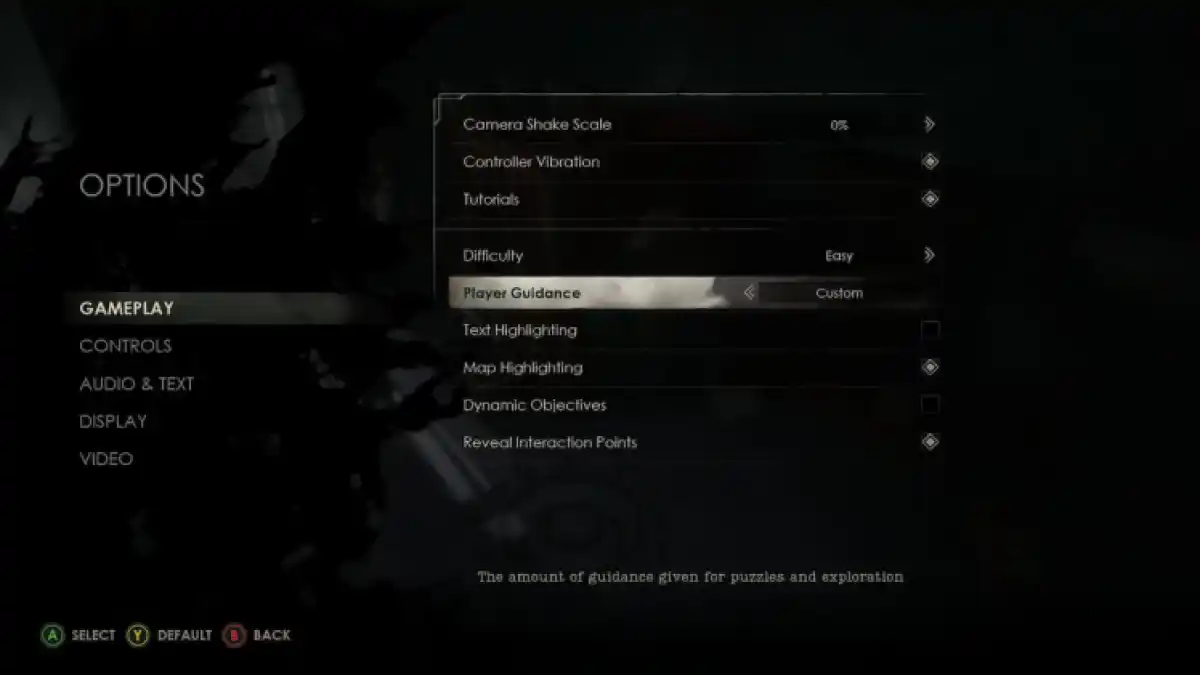
You can customize your Guidance preferences in the pause menu once you start a playthrough. Why select between Modern and Old School Guidance in Alone in the Dark, when you can manually turn on/off every Guidance setting in the game? Through my multiple playthroughs, I’ve found the best settings to keep on, and which ones are better left off.
Here are the best Guidance settings in Alone in the Dark:
- Text Highlighting: Off
- Map Highlighting: On
- Dynamic Objectives: Off
- Reveal Interaction Points: On
All Guidance settings in Alone in the Dark
- To go into detail, Text Highlighting does as it says, highlighting key text for clues you find throughout the game. Turning it on for a moment can be helpful if you’re having difficulty with a particular puzzle. But keeping it on all the time removes some of the fun of figuring out the solutions.
- Map Highlighting, which shows puzzles and doors that are unlockable/solvable, is one of two settings I recommend keeping on. Of course, you can go through clues to figure out where key items and keys go, but for the sake of not wasting time I’ve elected to keep this on. It’s one of those QoL updates you see in most survival horror games nowadays, like Resident Evil. So keeping Map Highlighting on makes the game less tedious and decreases the amount of backtracking you’ll have to do.
- Dynamic Objectives is a fancy way of saying you receive hints in your journal about how to progress. This would be all right if the hints weren’t the entire solution to that particular part of a puzzle. A little nudge in the right direction would have been nice but fully explaining the solution was a bit much. Because of this, I’ve elected to turn it off about halfway through my first playthrough. And while the puzzles don’t hit as hard as they do on the first go around, turning it off in subsequent playthroughs helps get rid of clutter in the journal, should you be attempting to get an alternate ending.
- Finally, Reval Interaction Points is probably the most useful Guidance setting in the entire game. It’s just a shame they don’t give you any info on how to use it. Before I called it after beating the game over five times, I pressed LB on my Xbox controller, zooming in close behind the shoulder of your character. I then came to find out that when you use this button around interactables, they’ll be highlighted as long as they are in your line of sight. This is extremely helpful when you’re missing that one Lagniappe and need to scan the entire environment.
Learn more
