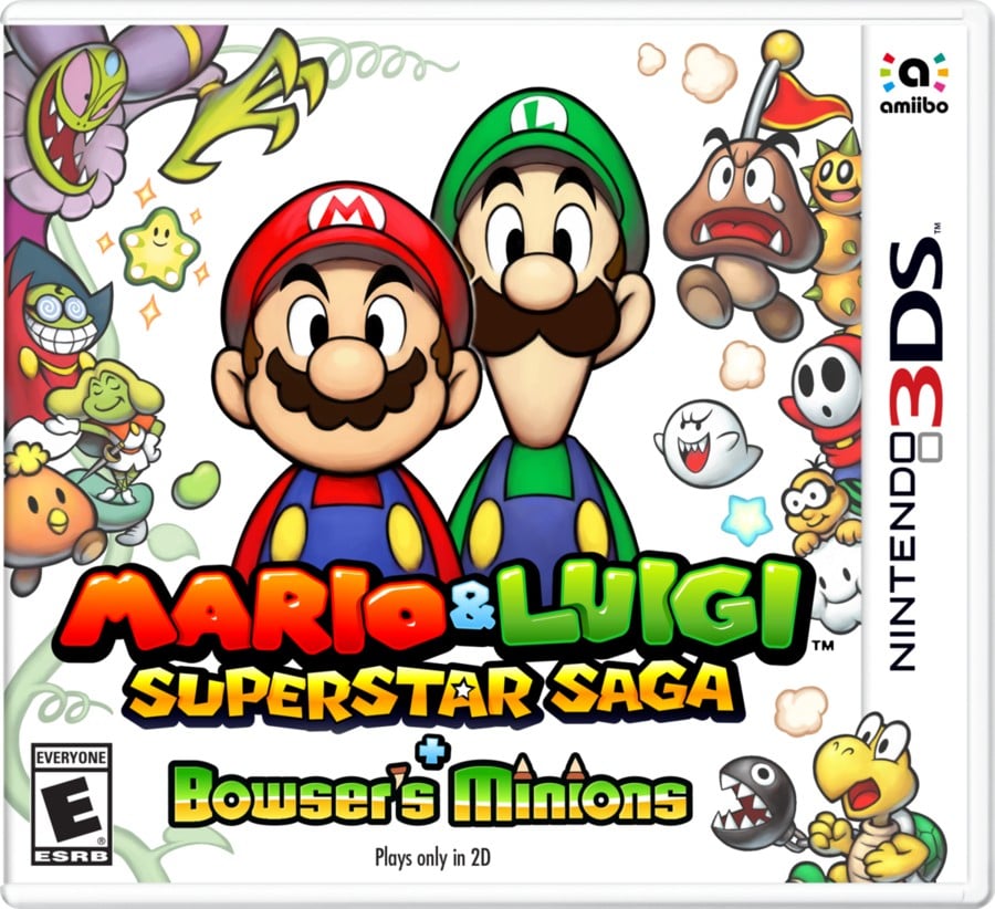
Box Art Designs: A Comparison Between Europe and North America/Japan
Cast your vote in the poll below, but first, let’s take a look at the box art designs for the game.
Europe
The European cover may seem busy, but it has its own charm. The main characters, Mario and Luigi, appear stressed, while the multitude of enemies and allies surrounding them hints at the various challenges that lie ahead. A particularly impressive feature is the placement of Cackletta directly above the heroes, creating a sense of intimidation.
North America / Japan

In contrast, the box art designs for North America and Japan are more minimalistic. The frames have fewer characters around the edges, and the dark background of the European cover is replaced with pure white. Mario and Luigi are depicted in a more relaxed pose, showing contentment rather than readiness for action. This lighter design suggests a different tone for the game.
Thank you for voting! Stay tuned for the next round of the Box Art Brawl.


