Before we get to the poll, take a look at the box art designs below.
North America
This box art is quite attractive. It features the protagonist and his loyal dog strolling across the box with the farm in the background. The art style is great, but the sudden change in color on the far right is a bit puzzling. It’s understandable that the color change is to make the logos stand out more, but the sudden reddish filter on the artwork seems a bit odd.
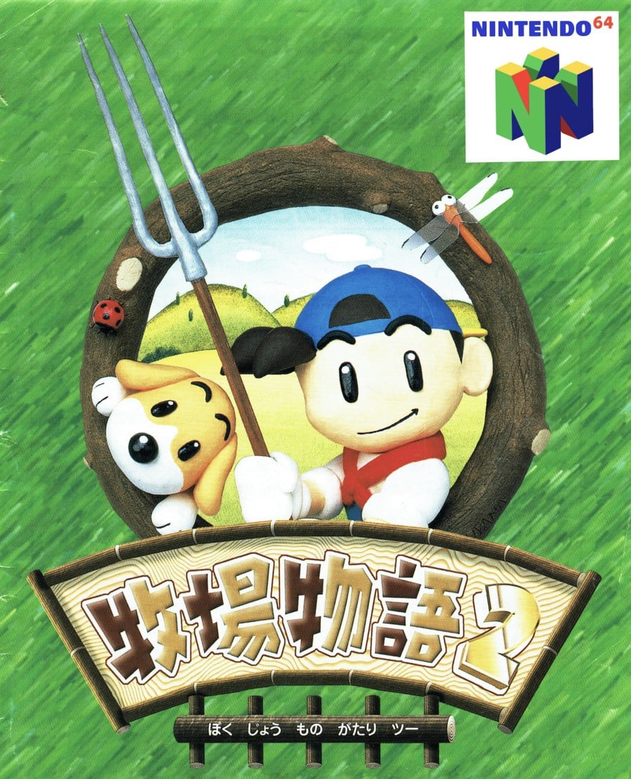
Japan

The Japanese box art for Harvest Moon 64 is more abstract, in keeping with the trends at the time. Once again, it features the protagonist and his dog, encased in a lovely portrait composition. The space surrounding the image is made to look like grass, and it’s remarkably well done. The art style itself is reminiscent of classic claymation and is quite similar to the look of the game.
Thanks for voting! More Box Art Brawl to come next time.


