Don’t forget to participate in the poll below before we delve into the box art designs.
North America / Europe
The box art for North America and Europe stays true to the classic Mario Golf aesthetic we all adore. Mario takes the spotlight in the center, mirroring the N64 cover. He is depicted mid-swing with a joyful expression, most likely after a successful shot. The logo hovers above him, while the golf course fades into the background. It’s a simple yet impactful design.
Japan

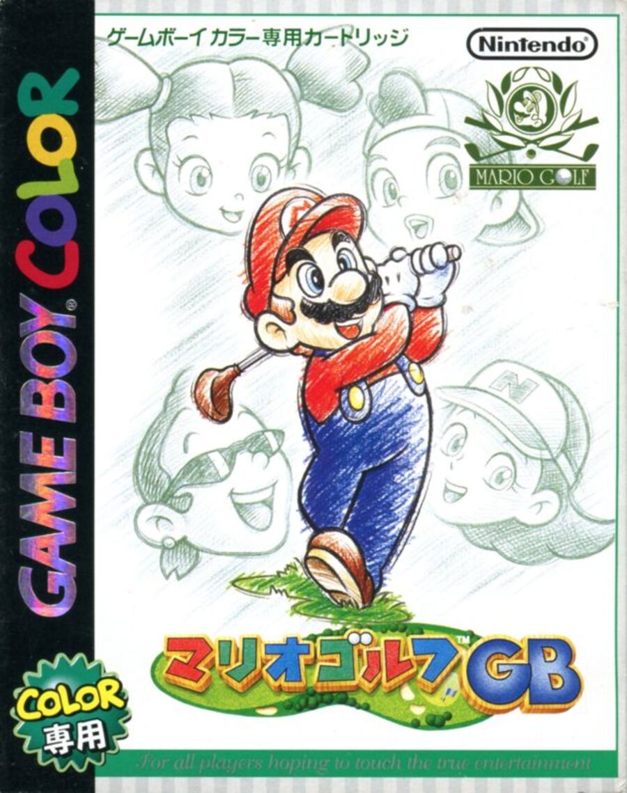
Japan’s box art, known as ‘Mario Golf GB’ in the region, takes a different approach that piques curiosity. It features a more minimalist design with a sketched style for Mario and the other golfers, whose oversized heads loom in the background. It’s subtle yet charming.
Thank you for participating in the poll! Stay tuned for the next edition of Box Art Brawl.


