
We have even added a poll to the bottom for you big up your favourite designs after taking a look at all of them (yep, we’re kind like that). Have a gander and then vote for your personal fave to see which comes out on top.
Happy scrolling!
Every Special Edition Switch Console
The following list is divided along the models in the Switch family of systems so you can check out each release for the Classic, OLED and Lite respectively. While some of the below systems were painfully rare on release, we have limited the collection to those that were available to buy, removing the limited edition consoles that were obtainable only by winning a contest or taking part in a charity event such as the AVICII Invector: Encore Edition and Jack Jeanne Lite consoles, and the Trials of Mana and LABO special edition Switches.
Everything else is fair game, so let’s kick things off with the classic Switch models…
Switch:
Monster Hunter XX
There is a ‘less is more’ mentality to many of the designs on this list, but the Monster Hunter XX special edition model (unique to Japan) is just a bit… ehh. Especially considering what this franchise is known for.
It’s a pretty nice dock design, we’ll give it that, but if you are keen to playing in handheld mode then you might as well have bought a standard grey model. Not the biggest “I love Monster Hunter XX” flag you could be flying–where are the monsters?!
Pokémon Let’s Go Pikachu / Eevee!
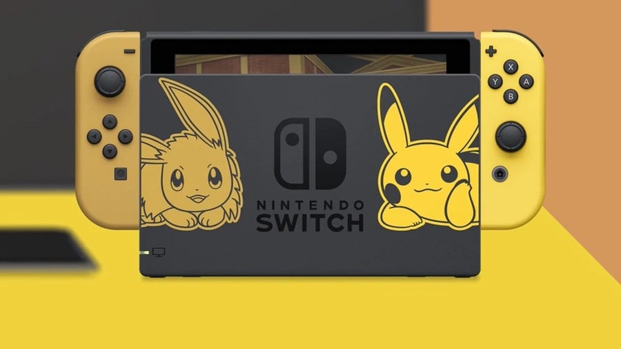
This was the first special edition Switch that was available worldwide, and Nintendo really got off to a good start. There are a lot of Pokémon-themed consoles out there (including Switch models), but we’d argue that the Let’s Go! edition is one of the best.
Walking the line between too subtle to notice and so OTT it’s hard to look at is a tough balancing act, but this one does it well. The uniquely-coloured Pikachu and Eevee-coloured Joy-Cos are enough to stand out from the standard designs and the detailing on the back of the console doesn’t look too crammed by comparison to some of the later editions.
If we had one complaint, it would be the giant full-colour titular ‘mon on the dock, but you can’t have it all we suppose.
Super Smash Bros. Ultimate
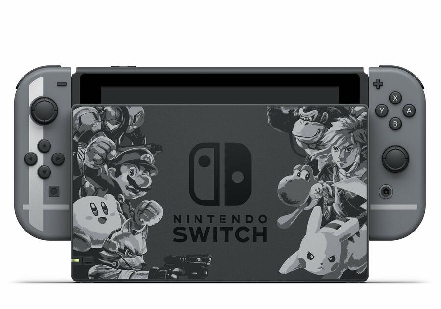
This is one of the more subtle designs for sure (at least in terms of the Joy-Con), but there is a certain elegance to the Smash Bros. Ultimate console that we didn’t expect from such a bright and in-your-face franchise.
The Joy-Con clearly display the Smash logo when put together (not that you could tell if you were looking at the right one only), but the dock is the true star here, showing off an image of the fighters going head to head in classy monochrome. How very suave!
Diablo III Eternal Edition

Continuing the trend of the ‘maybe we should add some colour to this’ designs, the Diablo III Eternal Edition Switch is one of the more pared-back models out there.
There are the two character designs on the dock itself and a small amount of detailing on the back of the console, but if it’s flashy designs that you’re after then there are definitely better places to look.
Dragon Quest XI
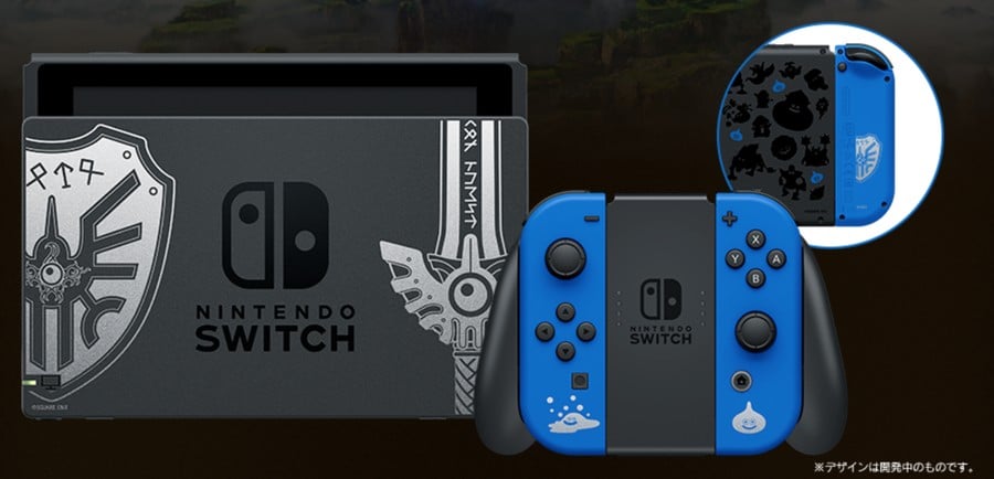
This is what the special edition Zelda design of our dreams looks like (if it wasn’t a Japan-only release, that is). The detailing is scaled back on the Joy-Con to only the franchise mascot slime and a bubble slime, and the Akira Toriyama monster designs on the back of the console keep up the black colouring so as to not stand out too much.
We are also big fans of the dock on this one. Just imagine the Master Sword and Hylian Shield sitting in those positions…
Disney Tsum Tsum Festival
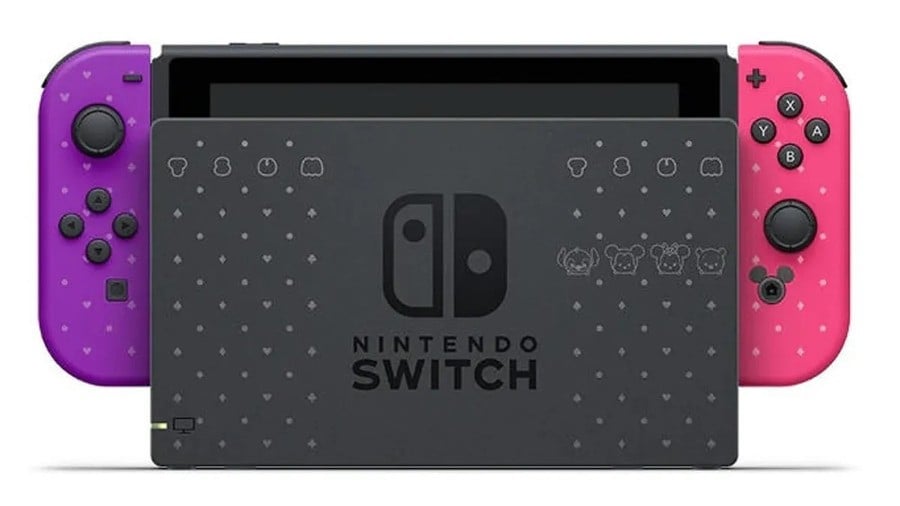
If Disney Tsum Tsum Festival got a special edition design that wasn’t all cutesy, then there would be riots in the streets. Fortunately, Nintendo pulled through on this Japan exclusive.
The speckled and diamond pattern is a nice change from the standard model and we like how this is followed through on the Joy-Con too. We can only imagine that the design team took an early lunch after thinking of turning the home button into Mickey Mouse. Inspired!
Animal Crossing: New Horizons

A game as wholesome as Animal Crossing: New Horizons deserves an equally-wholesome console to go alongside it, and Nintendo succeeded with a suitably cute and cosy machine.
The back of the console is covered in little island-themed details and the pastel Joy-Con just scream of a summer get away. This is all completed with a bright dock showing the Nook clan as they welcome you to your new retreat. It’s a prime example of ‘less is more’ and probably the most Instagrammable design out there.
Fortnite
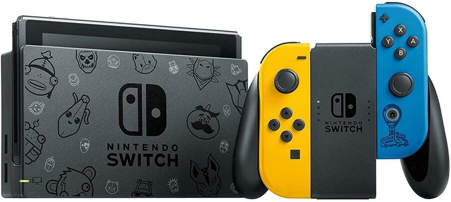
As one of the most popular games out there, it makes sense that Fortnite would get a special edition Switch all of its own. Say what you will about the game itself, but this design is undeniably sweeeeeet.
The character models on the console’s back and dock were always going to be a big hit with the Fortnight fans out there, but we also rate how restrained the Joy-Con designs are here. Let the colours speak for themselves and stick just a little detailing on there (Battle Bus around the home button is a nice touch) and you’re onto a winner in our book.
Mario Red + Blue
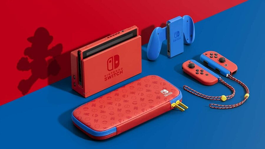
There are only a few brands that can be represented by their colours alone. Yellow and red is instantly McDonalds, purple and gold is the Lakers, royal purple is Cadbury chocolate. But red and blue? That’s Mario.
This design, released alongside Super Mario 3D World + Bowser’s Fury, knows that the simplicity speaks for itself. It doesn’t mess around by adding any intricate detailing at all. It might not be covered in the deepest-cut references, but getting your hands on a console colour other than grey is something that deserves celebration all the same.
Monster Hunter Rise
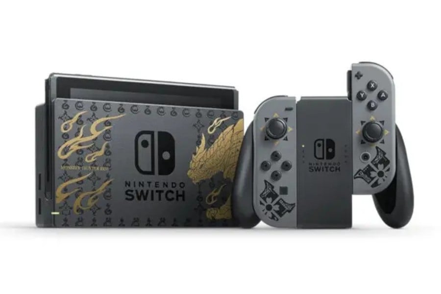
There is a lot going on with this one. Instead of deciding on a single motif to carry throughout the design, this just takes everything to do with Monster Hunter Rise and plasters it all over the console, Joy-Con and dock. What’s more, the detailing is in three different colours so there’s no mistaking its loudness.
It’s much better than the XX one, in our eyes, but does it actually benefit from having everything and the kitchen sink thrown at it? We’d say no, but that does lead nicely into the OLED designs…
OLED:
Why go subtle when you can go completely over the top? That is the question that we imagine Nintendo asked when designing the special edition consoles for the Switch OLED. We’re not saying that it was a bad idea, but its success is arguably varied.
Splatoon 3

It makes sense that Splatoon 3 would have a special edition design that goes all out for the freshest design outside of Splatsville. From the gradient-coloured Joy-Con to the detailing which is crammed in over the entire body, this is a look that screams Splatoon and it definitely works as as a result.
We’re particular fans of the singular yellow ink splat on the dock. It would have been easy to go over the top with the splatter marks, so it is nice to see that some restraints were taken.
Pokémon Scarlet and Violet
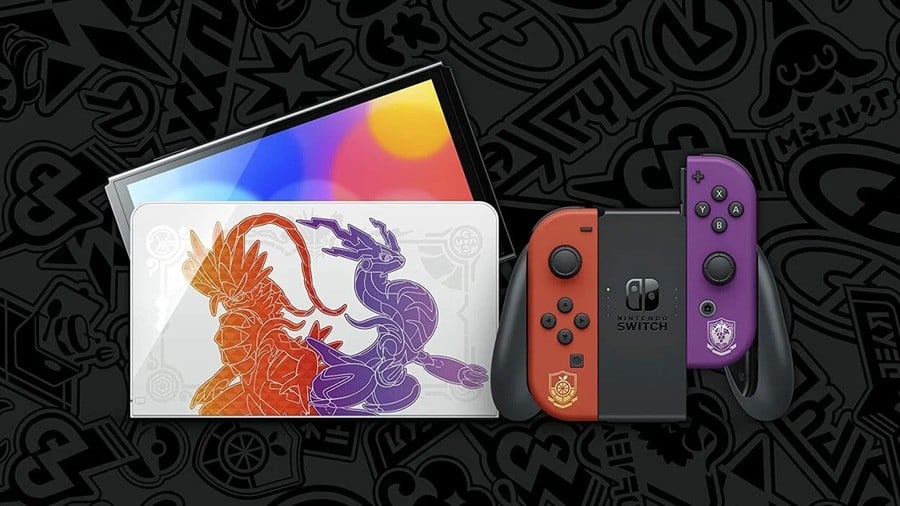
Yes, the all-out design works for something like Splatoon. You know what it doesn’t work quite so well for? Pokémon.
Looking at this special edition design from the front, we were pretty impressed. After all, those are some nice colours on the Joy-Con and the detailing is kept to a minimum while nicely representing the Academys from Scarlet and Violet. Good work Nintendo, we sure are glad that you didn’t overcrowd the back of the Swi- oh no, what?!
The colouring takes what could have been a subtle design and turns it into the outer casing of a 13 year-old’s first laptop. Remember when we said “less is more”? This is the reason why.
Lite:
Yes, the Switch Lite might forever be remembered as “the Switch that doesn’t”, but that doesn’t take away from some pretty nice designs on the special edition front.
Pokémon Sword and Shield
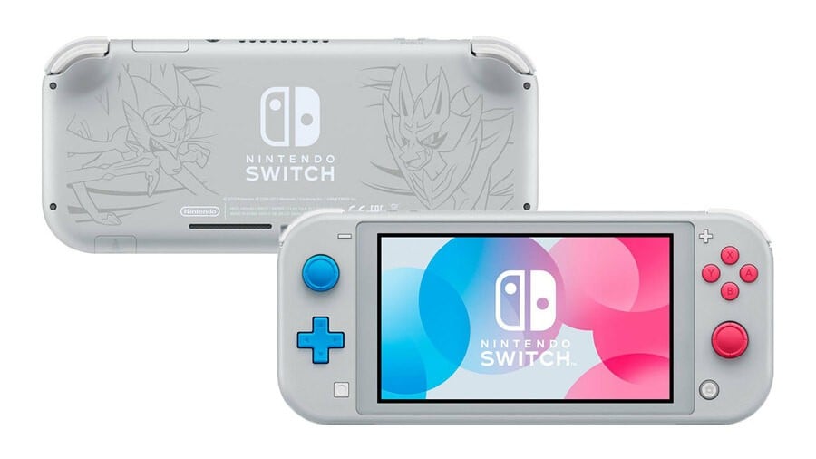
The design for the Pokémon Sword and Shield console is an all-around pared-back affair and you know what? it works because of it.
The silver/white casing is a classy touch and it manages to make the Zacian and Zamazenta line drawings on the back that little bit less imposing. The jury is still out on the magenta and blue control buttons, but we suppose that Nintendo had to squeeze in a reference to the different versions somehow.
Pokémon Brilliant Diamond and Shining Pearl
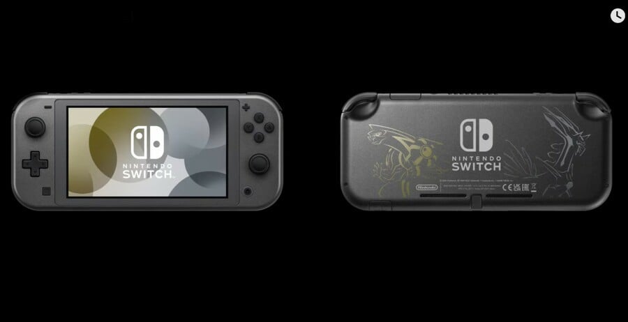
Oof, now this is a sleek design. Is there anything classier than black, gold and silver? Probably not. This is a console that you play after finishing your espresso from your penthouse sweet.
The actual relevance to Pokémon Brilliant Diamond and Shining Pearl is limited to the Dialga and Palkia line drawings on the back, but we don’t always need the game to be so in your face. It’s dialled back and it works.
There you have all of the major special edition Switches, but which is your favourite? Fill out the following poll and then take to the comments to let us know which is the most special of them all — and let us know if we missed something!
Read the full story at: Source link