
Be sure to cast your votes in the poll below; but first, let’s check out the box art designs themselves.
North America / Europe
The box art for North America and Europe has a lot going on, but it does a pretty good job of capturing what WarioWare is all about. The bright yellow backdrop reminds us of the early games in the series and we like how all the minigame characters are crammed in around Wario at the top. The design gives us vibes of Rhythm Heaven Megamix, and that’s perfectly fine with us.
Japan
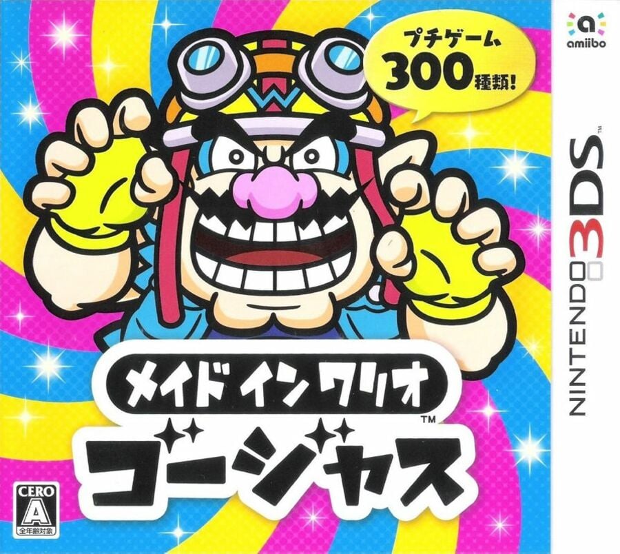
The Japanese cover takes a different approach compared to the rest of the world, but it still manages to capture that chaotic vibe. The bright spiral pattern behind Wario, in his creepy pose, is more eye-catching than the plain yellow. While it might not do the best job of explaining the game, it definitely draws you in.
Thanks for voting! We’ll see you next time for another round of the Box Art Brawl.